Building on Auto Layout
- 9 minsAuto Layout is the constraint-based layout framework for iOS and OS X. At its core it replaces setFrame with addConstraint. Where you would previuosly give the exact coordinates of a view, now you describe the view’s location in relation to other views. It is common to use addConstraint directly, but Auto Layout is actually a great engine to build layout systems on top of. In this post I’ll talk about different abstraction layers on Auto Layout and show its advantages with my library StackLayout.
The simplest way we can build on Auto Layout is a thin syntactic layer for creating constraints that we still manage manually. Until iOS 9, the built-in way to create a constraint was quite verbose. For example, to make the height of two views equal:
NSLayoutConstraint(item: redView, attribute: .Height,
                   relatedBy: .Equal,
                   toItem: blueView, attribute: .Height,
                   multiplier: 0, constant: 0)
The new Layout Anchor API makes this much easier to read:
redView.heightAnchor.constraintEqualToAnchor(blueView.heightAnchor)Other layout libraries do similar things. I am a fan of PureLayout. These methods help you create a constraint or two, but wouldn’t be called layout systems on their own.
Higher up the abstraction scale is the Visual Format Language. When I interned at Apple on the Cocoa Frameworks team I helped with the initial implementation of Auto Layout and especially on the parser for the VFL. This lets you specify a few common layouts that can be written as ascii art.
I’ve experimented by reimplementing some of it in Swift using operator overloading. The idea is the same, but has the advantage of compile-time checking. By glancing at the code you should be able to see the layout.
view.addConstraints(horizontalConstraints(
  |-5-[redView]-0-[greenView]-0-[blueView]-5-|
))
When using the Visual Format Language you aren’t as concerned with each constraint, but the array of constraints is still passed back to you to manage yourself. It would be difficult to find one of those constraints and edit it later.
Even more interesting are libraries that are higher on the ladder of abstraction. UIStackView, also new in iOS 9, is a great example of this. Internally it uses Auto Layout, but you can get pretty far without ever managing a constraint yourself. Rather than constraints, you are dealing directly with ideas of alignment and spacing. I’ve got a similar layout library, StackLayout, which I’d like to talk about more.
Most layouts in practice are some variation on laying out views side-by-side vertically or horizontally in a container. Here is an example from Paper:
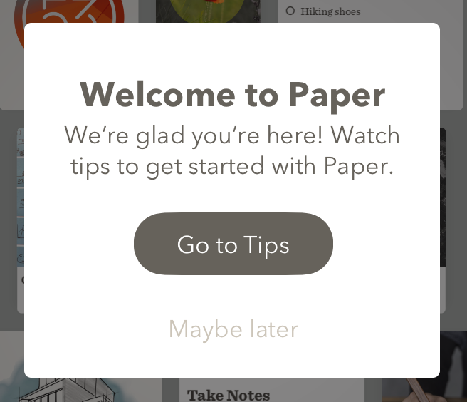
Described in english, this is 4 views arranged vertically. The container fits the contents except for some margins on the sides. There is consistent spacing except between the title and body. This is how it is written with StackLayout:
let verticalLayout = tipView.addSubviewsWithVerticalLayout(
    [titleLabel, bodyLabel, tipsButton, laterButton]
) { layout in
    layout.verticalAlignment = .Fill
    layout.horizontalMargins = 25
    layout.topMargin = 34
    layout.bottomMargin = 17
    layout.spacing = 21
    layout.setSpacing(5, between: titleLabel, and: bodyLabel)
}
Not only does this create all of the constraints for you, it returns a layout object which keeps track of those constraints and lets you modify them later. For example, the horizontal margins can be increased.
verticalLayout.horizontalMargins = 55This is pretty similar to other layout systems, such as CSS’s flexbox. The fact that it is built on Auto Layout gives you some great advantages. It is a leaky abstraction in the best way.
Sizing children
Before Auto Layout, there was only one way to ask a subview what size it prefers to be, sizeThatFits(size: CGSize). Container views had to reimplement this method and do the math to combine all children sizes appropriately. This was often a duplication of the layout logic. Now, only “leaf” controls need to implement the Auto Layout intrinsicContentSize and the same constraints that govern layout also bubble up sizing information with contentFittingSize.
The old sizeThatFits method also couldn’t express subtleties, like the fact that a slider can be any width greater than ~40 but there is exactly one correct height. Or the way that a button can get smaller than its icon / label if it absolutely needs to (contentCompressionResistancePriority), or that it can get wider than its perfect size but it would rather not (contentHuggingPriority).
Sizing children views is no small task and it is a huge advantage that each layout system built on Auto Layout can take it for granted.
Exceptions to the rule / priorities
Layout systems usually have a few general rules that take care of most cases. StackLayout is a single row or column with spacing, alignment, and margins. It is a great system that will do absolutely everything you need, unless you are building interfaces meant for humans. Those inevitably have 1000’s of exceptions to the rules.
The exceptions are what make layout so tricky. If a layout system needed to accommodate every edge case the API and complexity would get out of hand. Instead of each layout system handling every exception, Auto Layout gives a convenient way to manually override some detail.
For example, in this login dialog the email field is below the Paper logo, except when it is not:
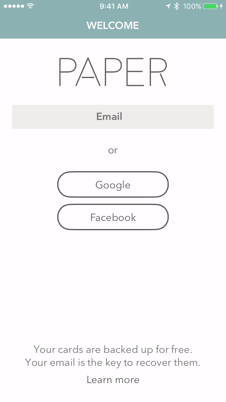
What vertical alignment should I use there? In StackLayout I can have it be top-aligned with a low priority, and then use a higher-priority constraint to move the email field below the logo. Additionally, I’ll need to override the width of the buttons to be equal widths.
loginView.layoutMargins = UIEdgeInsets(top: 30.0,  left: 20.0,
                                    bottom: 20.0, right: 20.0)

loginView.addSubviewsWithVerticalLayout(
    [logoView]
) { layout in
    layout.layoutMarginsRelativeArrangement = true
    layout.verticalAlignment = .Top
    layout.horizontalAlignment = .Center
}

loginView.addSubviewsWithVerticalLayout(
    [emailField, orLabel, googleButton, facebookButton]
) { layout in
    layout.layoutMarginsRelativeArrangement = true
    layout.horizontalAlignment = .Center
    // Top-aligned but with a low priority to be overriden
    layout.verticalAlignment = .Top
    layout.marginsPriority = UILayoutPriorityDefaultLow
    layout.spacing = 10
}

let logoToEmail = emailField.bottomAnchor
    .constraintEqualToAnchor(logoView.bottomAnchor, constant: 30)
logoToEmail.active = true // Deactivate to let the controls float to the top

// Other exceptions to the layout
orLabel.heightAnchor.constraintEqualToConstant(50).active = true
googleButton.widthAnchor
    .constraintEqualToAnchor(facebookButton.widthAnchor).active = true
googleButton.widthAnchor.constraintEqualToConstant(185)
Cross-layout constraints
Auto Layout lets views position relative to each other even if they don’t share a layout manager or if they have have different superviews.
The login dialog earlier has a Continue and Cancel button which should line up with existing buttons during the animation. There is also a loading indicator that might show where the Continue button is.
I can use the earlier layout without changing it and add the three new controls. There are ways to hack this in other layout systems using wrapper views, but Auto Layout makes it pretty natural.
// Align Continue with Google
continueButton.centerXAnchor.constraintEqualToAnchor(
    googleButton.centerXAnchor).active = true
continueButton.centerYAnchor.constraintEqualToAnchor(
    googleButton.centerYAnchor).active = true

// Align Cancel with Facebook
cancelButton.centerXAnchor.constraintEqualToAnchor(
    facebookButton.centerXAnchor).active = true
cancelButton.centerYAnchor.constraintEqualToAnchor(
    facebookButton.centerYAnchor).active = true

// Align loading indicator with Continue
loadingIndicator.centerXAnchor.constraintEqualToAnchor(
    continueButton.centerXAnchor).active = true
loadingIndicator.centerYAnchor.constraintEqualToAnchor(
    continueButton.centerYAnchor).active = true

// Later, use alpha to fade the buttons in and out
Pixel Integralization
“Pixel-integralization” is making sure that frames of components fall on pixel boundaries, rather than a blurry line in between two pixels. This is trickier than it sounds — if you just round all of the frames you won’t get the best results. Auto Layout has the global knowledge needed to make everything fall on pixel boundaries even on the iPhone 6+ where each point is 2.6 pixels.
RTL languages
Another tricky issue is support for RTL languages. When you read right-to-left, it makes sense to switch the entire interface so labels are on the right and actions are on the left. If you use the Leading and Trailing attributes on Auto Layout this is done automatically for you.
If you’ve liked these examples, give StackLayout a try. It is available on CocoaPods, where I hope to see more layout systems built on the Auto Layout engine too.

Bridger Maxwell
I’m an iOS-and-other-stuff developer in NYC. I’m a founder of Scribble and work at Facebook.